The Netflix of classic Nintendo games
A playful interaction design project 🎮
Overview
Imagine a library of classic Nintendo games at your fingertips: Making a choice might be difficult, like deciding what to watch on Netflix. True, a service called Nintendo Switch Online launched in September 2018. But in March that year, as a graduate student at University of Michigan, I envisioned how you might discover and choose a game to play within the Nintendo Switch design language.
A video walkthrough of the final prototype I created. This is the outcome of research and iteration described below.
Being a gamer, I had to remind myself “you are not the user” (even though I totally was).
My Role
Since this was an individual project, I was the design and planning lead, handling everything from ideation to interaction design. That means I had the freedom to choose the creative direction, but also the challenge to keep it within scope. Thankfully, I had peer feedback and expert instruction to guide the process.
An animated GIF shows the cutouts I created to demonstrate the paper prototype and to test with other people.
ProcesS
Scoping the project
Instead of tackling every aspect of online gaming, I aimed at choosing the perfect game. I designed a preference-driven recommendation system to guide users to their match.
Defining the audience
Good design is the result of asking, “Who is this for?” early and often. Interviewing my peers allowed me to understand user needs and to solve for specific pain points, like how to find tailored recommendations.
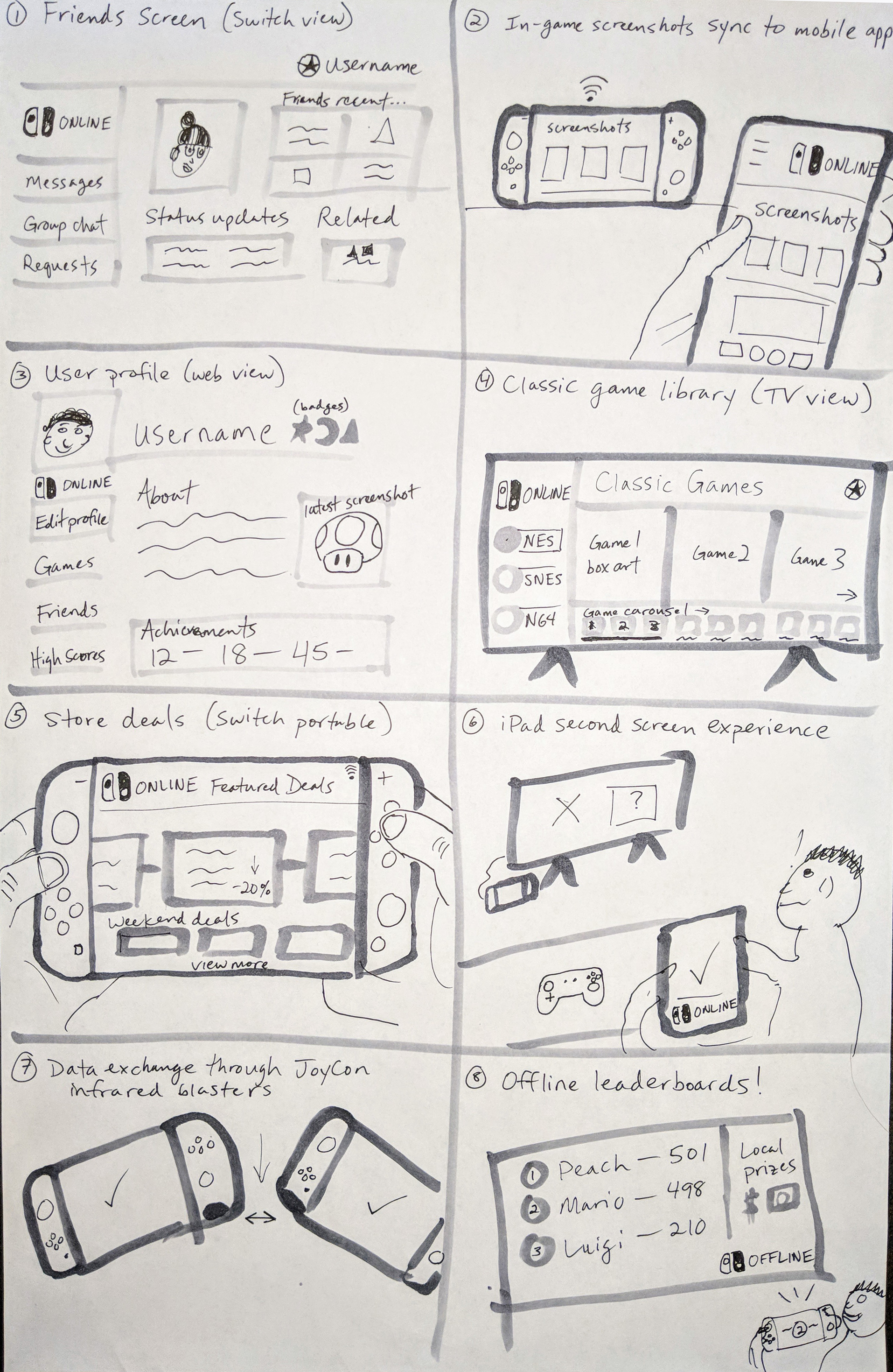
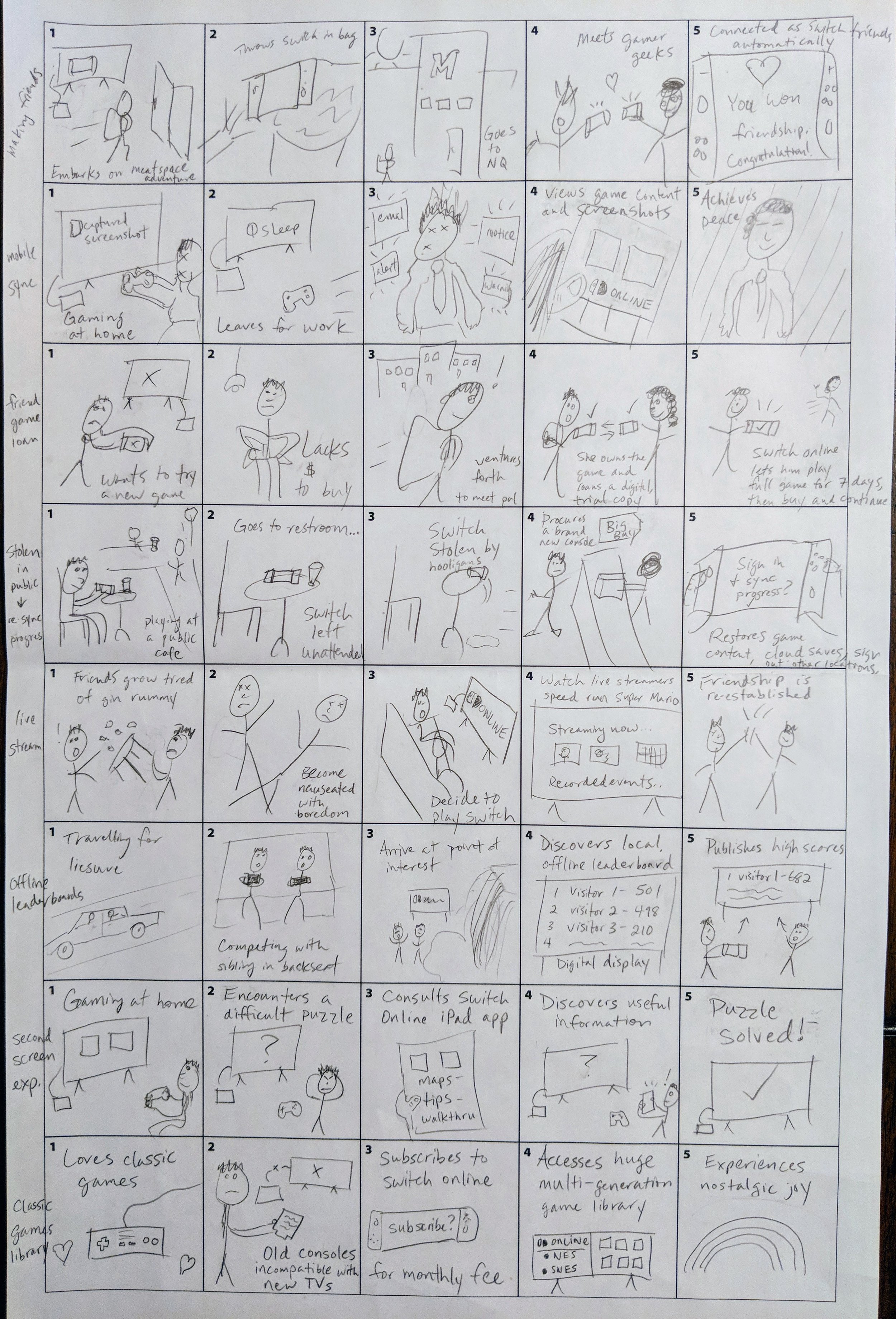
Creating sketches and prototypes
I started by drafting ideas on paper, using storyboards to define user context — indoors, on the go, or with friends. Wireframes helped me ideate and think visually—a productive exercise that helped me realize some ideas were not worth pursuing.
Screen Design
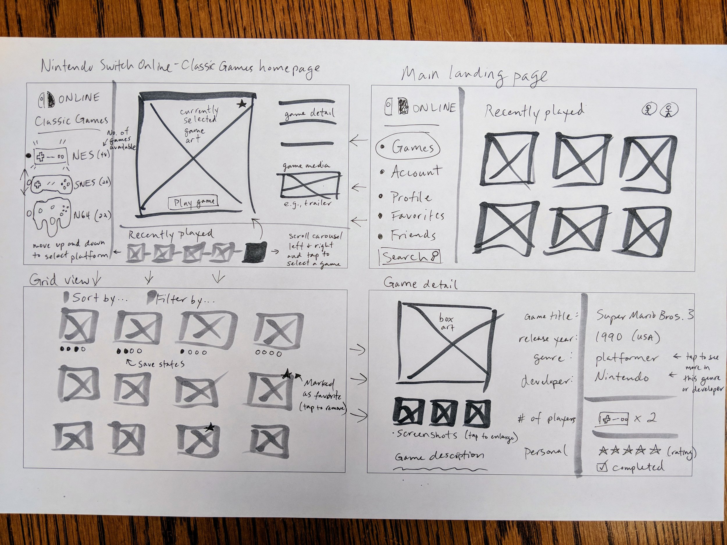
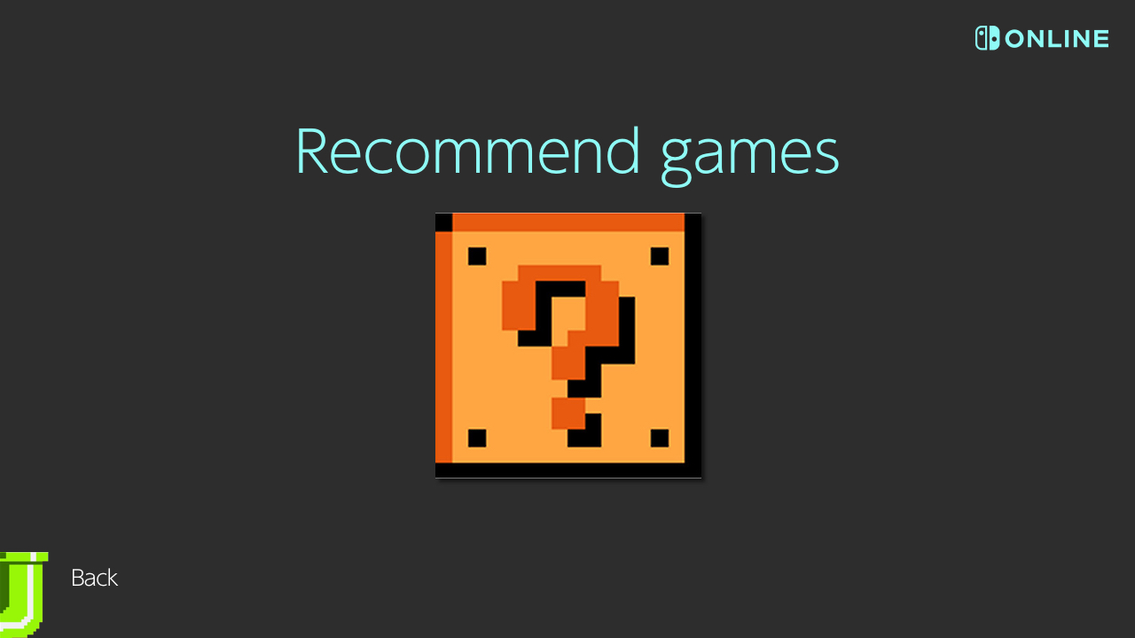
Starting at the Switch home screen designed by Nintendo, I added a new, system-level Online app, followed by the main landing page. Players can explore multiple content areas, but the focus is on finding and playing classic games. They can use the recommendation wizard, browse alphabetically, jump to their favorites, or see a random game. Another key feature lets them mark games as favorites to easily find and play later. The game recommendation wizard is the main user flow (“Ask the wizard”).
Three key pieces of my visual design were:
Large, easy-to-tap targets intended for touch since Switch has a touchscreen.
A dark mode color scheme based on the Nintendo’s theme "Basic Black."
Artwork constrained to 16:9 ratio native to the Nintendo Switch and most TVs.


Personas
Based on secondary market research and peer feedback, I wrote two user personas to serve as the primary audience. My goal was to narrow the field of potential solutions until the end result solved a specific problem. For my project, that problem is finding the perfect game to play.
Cory is the “core” gamer who demands the best from the experience with all of its competitive features.
Casey is the “casual” who just wants to have fun with her friends occasionally.
What I learned
I practiced a variety of skills in this project that are broadly applicable to UX design projects:
Audience analysis
Paper prototyping
Personas and scenarios
Storyboarding
As for tools, I cultivated my expertise of Figma and Sketch for UI design and Principle for interactions and animations.